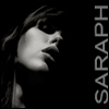
Gouken Posted April 4, 2004 Posted April 4, 2004 Let the critic's begin.... By the way, this is my first vector work.
ME! Posted April 4, 2004 Posted April 4, 2004 nice design. good use of positive and negitive space, and also, nice contrast with the flow of the hair. the bottom one is my favorite for the colors chosen. you've got an interesting style. keep it up.
Chaotica Posted April 4, 2004 Posted April 4, 2004 I like the bottom one too, the colours work very well. You certainly have talent, mate, keep up the good work. One question - maybe put more emphasis on the words? They don't stand out too well, but then again I don't know how much you want them to stand out.

Recommended Posts
Create an account or sign in to comment
You need to be a member in order to leave a comment
Create an account
Sign up for a new account in our community. It's easy!
Register a new accountSign in
Already have an account? Sign in here.
Sign In Now